聊天消息
大约 4 分钟
聊天消息
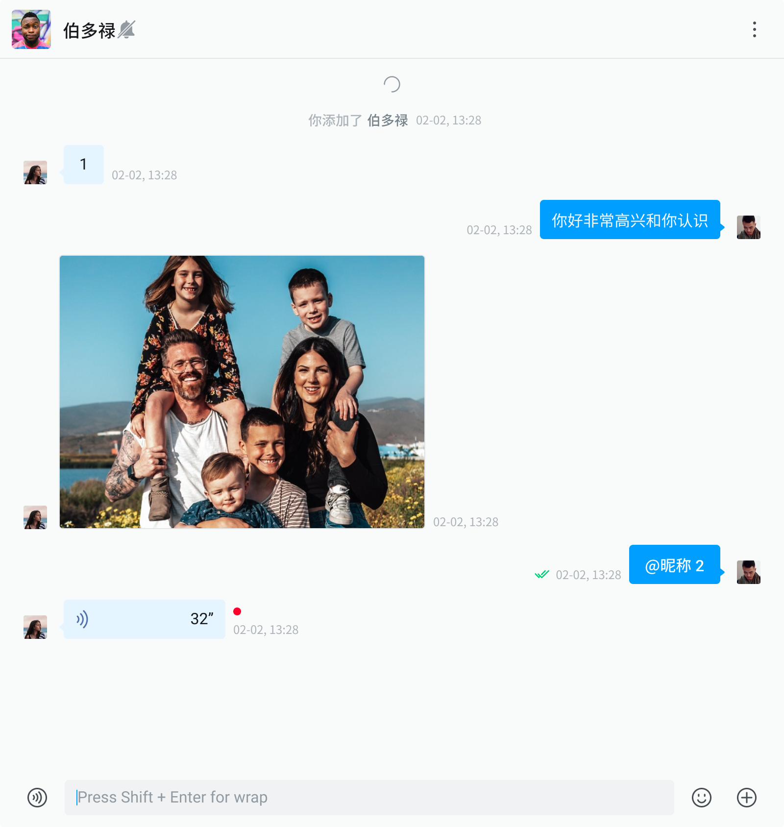
Chat 组件提供了以下功能:
- 发送和接收消息, 包括文本、表情、图片、语音、视频、文件和名片消息。
- 对消息进行复制、引用、撤回、删除、编辑、重新发送和审核。
- 从服务器拉取漫游消息。
消息相关功能,详见功能介绍文档。
使用示例
import React from "react";
import { Chat } from "easemob-chat-uikit";
import "easemob-chat-uikit/style.css";

const ChatContainer = () => {
  return (
    <div style={{ width: "70%", height: "100%" }}>
      <Chat />
    </div>
  );
};
自定义
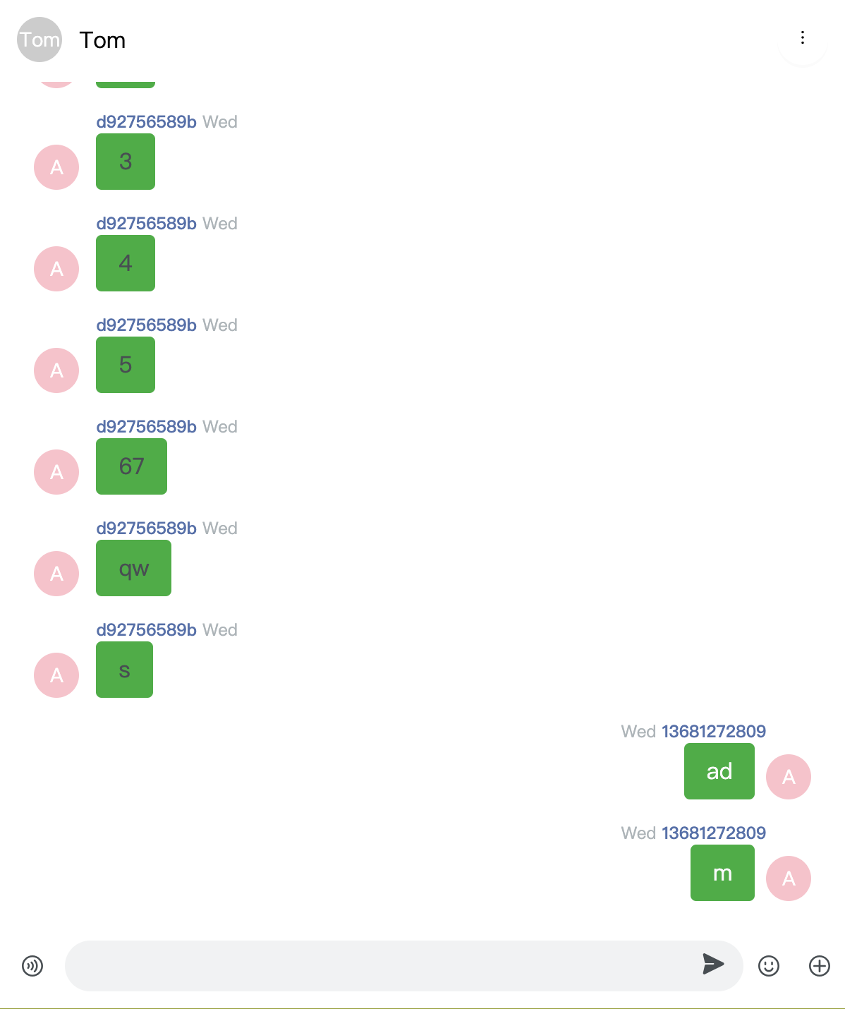
修改消息气泡样式
以文本消息为例,你可以按如下方式修改消息气泡样式:
- 使用
renderMessageList方法自定义渲染消息列表。 - 使用
renderMessage方法自定义渲染消息。 - 通过
TextMessage的属性自定义文本消息。
import React from "react";
import { Chat, MessageList, TextMessage } from "easemob-chat-uikit";
import "easemob-chat-uikit/style.css";

const ChatContainer = () => {
  const renderTxtMsg = (msg) => {
    return (
      <TextMessage
        bubbleStyle={{ background: "hsl(135.79deg 88.79% 36.46%)" }}
        shape="square"
        status={msg.status}
        avatar={<Avatar style={{ background: "pink" }}>A</Avatar>}
        textMessage={msg}
      ></TextMessage>
    );
  };

  const renderMessage = (msg) => {
    if (msg.type === "txt") {
      return renderTxtMsg(msg);
    }
  };

  return (
    <div style={{ width: "70%", height: "100%" }}>
      <Chat
        renderMessageList={() => <MessageList renderMessage={renderMessage} />}
      />
    </div>
  );
};
在消息编辑器中添加自定义图标
在消息编辑器添加一个自定义图标,实现指定的功能:
- 使用
renderMessageInput方法自定义渲染消息编辑器。 - 使用
actions自定义MessageInput组件。
import React from "react";
import { Chat, Icon, MessageInput } from "easemob-chat-uikit";
import "easemob-chat-uikit/style.css";

const ChatContainer = () => {
  // 在消息编辑器中添加图标
  const CustomIcon = {
    visible: true,
    name: "CUSTOM",
    icon: (
      <Icon
        type="DOC"
        onClick={() => {
          console.log("click custom icon");
        }}
      ></Icon>
    ),
  };

  const actions = [...MessageInput.defaultActions];
  // 在 textarea 后面插入自定义图标
  actions.splice(2, 0, CustomIcon);
  return (
    <div style={{ width: "70%", height: "100%" }}>
      <Chat renderMessageInput={() => <MessageInput actions={actions} />} />
    </div>
  );
};

实现发送自定义消息
- 使用
messageStore中提供的sendMessage方法发送自定义消息。 - 使用
renderMessage渲染自定义消息。
提示
为了保证消息在当前会话中展示,消息中的 to 字段必须是对方的用户 ID 或者群组的 ID。
import React from "react";
import {
  Chat,
  MessageList,
  TextMessage,
  rootStore,
  MessageInput,
  Icon,
} from "easemob-chat-uikit";
import "easemob-chat-uikit/style.css";

const ChatContainer = () => {
  // 展示自定义消息
  const renderCustomMsg = (msg) => {
    return (
      <div>
        <h1>Business Card </h1>
        <div>{msg.customExts.id}</div>
      </div>
    );
  };
  const renderMessage = (msg) => {
    if (msg.type === "custom") {
      return renderCustomMsg(msg);
    }
  };

  // 在消息编辑器中添加图标
  const CustomIcon = {
    visible: true,
    name: "CUSTOM",
    icon: (
      <Icon
        type="DOC"
        onClick={() => {
          sendCustomMessage();
        }}
      ></Icon>
    ),
  };
  const actions = [...MessageInput.defaultActions];
  actions.splice(2, 0, CustomIcon);

  // 实现发送自定义消息
  const sendCustomMessage = () => {
    const customMsg = AgoraChat.message.create({
      type: "custom",
      to: "targetId", //消息接收方:单聊为对端用户 ID,群聊为群组 ID。
      chatType: "singleChat",
      customEvent: "CARD",
      customExts: {
        id: "userId3",
      },
    });
    rootStore.messageStore.sendMessage(customMsg).then(() => {
      console.log("send success");
    });
  };
  return (
    <div style={{ width: "70%", height: "100%" }}>
      <Chat
        renderMessageList={() => <MessageList renderMessage={renderMessage} />}
        renderMessageInput={() => <MessageInput actions={actions} />}
      />
    </div>
  );
};
修改聊天相关的主题
Chat 组件提供了聊天页面主题相关的变量支持自定义,如下所示。关于如何修改主题,请点击这里。
$chat-bg: $component-background;
$msg-base-font-size: $font-size-lg;
$msg-base-color: $font-color;
$msg-base-margin: $margin-xs 0;
$msg-base-padding: 0 $padding-lg;
$msg-bubble-border-radius-left: 12px 16px 16px 4px;
$msg-bubble-border-radius-right: 16px 12px 4px 16px;
$msg-bubble-arrow-border-size: 6px;
$msg-bubble-arrow-bottom: 8px;
$msg-bubble-arrow-left: -11px;
$msg-bubble-arrow-right: -11px;
$msg-bubble-color-secondly: $blue-95;
$msg-bubble-color-primary: $blue-5;
$msg-bubble-font-color-secondly: $font-color;
$msg-bubble-font-color-primary: $gray-98;
$msg-base-content-margin: 0 $margin-xs 0 $margin-sm;
$msg-base-content-padding: $padding-xs $padding-sm;
$msg-base-content-minheight: 24px;
$msg-bubble-none-bg: transparent;
$msg-bubble-none-color: $font-color;
$msg-bubble-square-border-radius: 4px;
$msg-info-margin-left: $margin-sm;
$msg-nickname-font-size: $font-size-sm;
$msg-nickname-font-weight: 500;
$msg-nickname-font-color: #5270ad;
$msg-nickname-height: 16px;
$msg-time-font-size: $font-size-sm;
$msg-time-font-weight: 400;
$msg-time-font-color: $gray-7;
$msg-time-height: 16px;
$msg-time-margin: 0 $margin-xss;
$msg-time-width: 106px;
Chat 组件属性总览
Chat 组件包含以下属性:
| 属性 | 类型 | 描述 |
| className | String | 组件的类名。 |
| prefix | String | CSS 类名前缀。 |
| headerProps | HeaderProps | Header 组件中的属性。 |
| messageListProps | MsgListProps | MessageList 组件中的属性。 |
| messageInputProps | MessageInputProps | MessageInput 组件中的属性。 |
| renderHeader | (cvs: CurrentCvs) => React.ReactNode | 自定义渲染 Header 组件的方法。 |
| renderMessageList | () => ReactNode; | 自定义渲染 MessageList 组件的方法。 |
| renderMessageInput | () => ReactNode; | 自定义渲染 MessageInput 组件的方法。 |
| renderEmpty | () => ReactNode; | 自定义渲染空内容组件的方法。 |